A Playful Identity for a Welcoming Cultural Collective
The Challenge
The challenge was to evolve the Ninho brand to more deeply express its core ethos: the feeling of a "ninho" (Portuguese for "nest"), representing a safe and welcoming space for its community. A new visual system was required to translate this atmosphere across the brand's growing number of projects, from live events and radio shows to podcasts and social media content.
The Solution
The Solution
The solution was a new identity that balances playful nostalgia with a mature design sensibility. Drawing inspiration from classic cartoons and Brazilian Modernism, the system reinterprets these global and local influences into a unique visual language. The characters and assets work as a playful anchor, while the modular layouts and sophisticated typography system adds a layer of refinement.
The Result
The new identity had a significant market impact. After the launch, the brand saw a surge in Instagram engagement and became highly memorable within the independent Brazilian electronic music scene. The new system successfully boosted all of the collective's verticals under a single, unified visual identity.
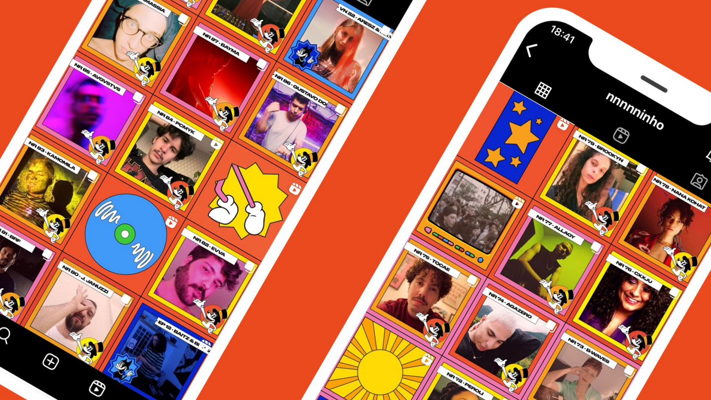
The Ninho visual identity was built on a foundation of flexibility, designed to be adaptable across the collective's diverse range of projects, from live event promotions to digital content. The system's key characteristic is its ability to seamlessly blend its graphic elements with real-world assets like photography and video, ensuring a cohesive yet dynamic brand presence on any platform.
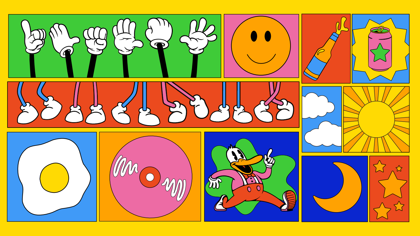
The visual system is based on a "Tetris-like" arrangement of boxes where elements can be fit together. This allows for a flexible replication of assets, designed to evoke the feeling of vintage comics.
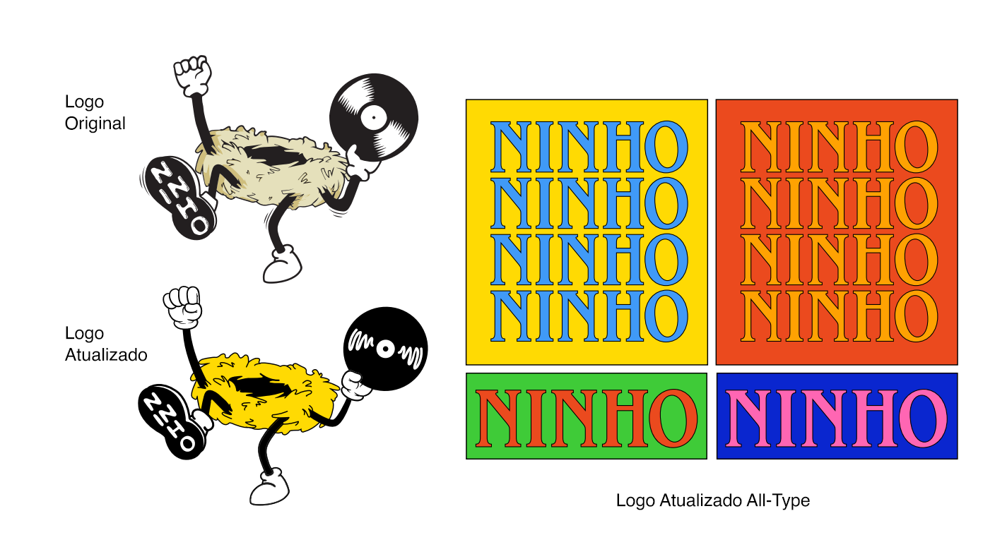
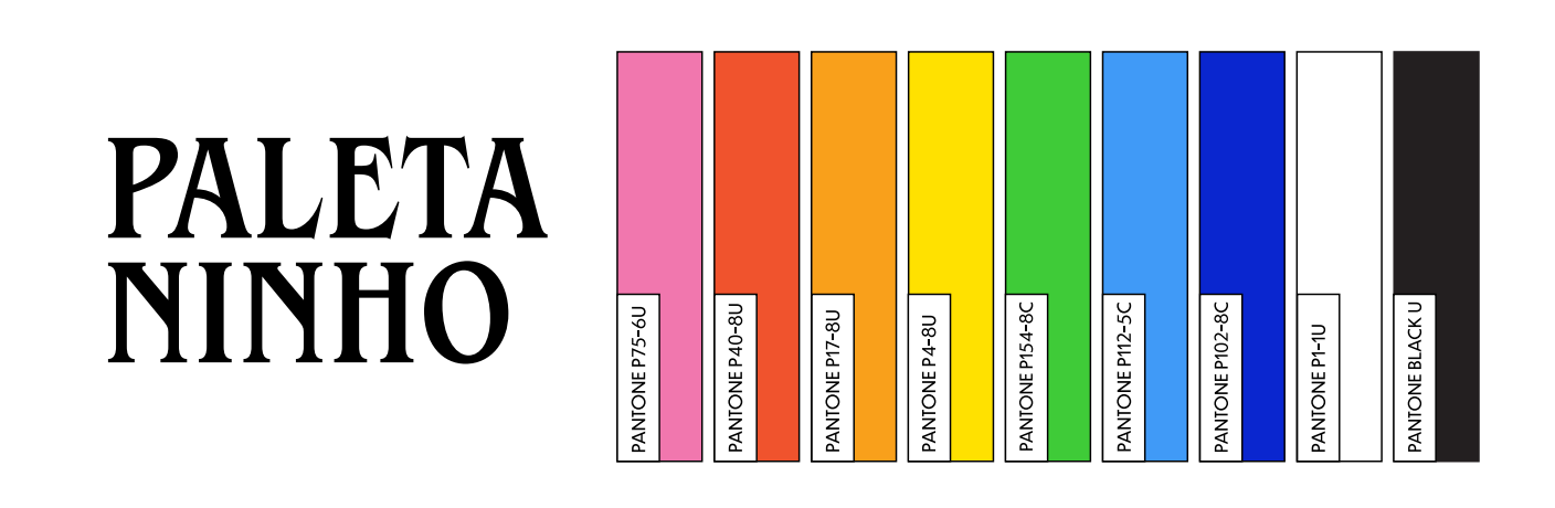
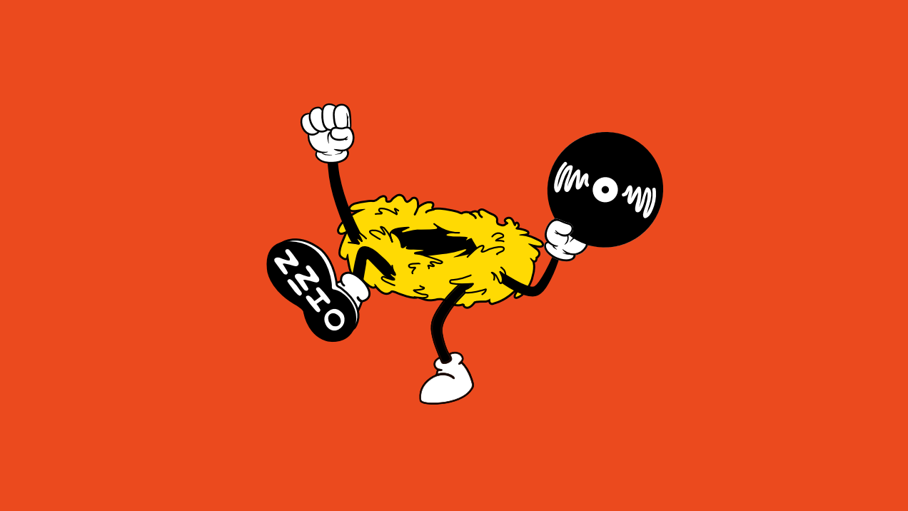
The Ninho identity system features several key elements. The original mascot was repaginated with a rounder, simpler line style to maintain its playful character. To complement the icon, a new typographic sublogo was introduced for more versatile applications. The new Ninho palette is composed of a wide range of open tones, and the diversity of colors brings dynamism to the design, contributing to the brand's cartoonish atmosphere.
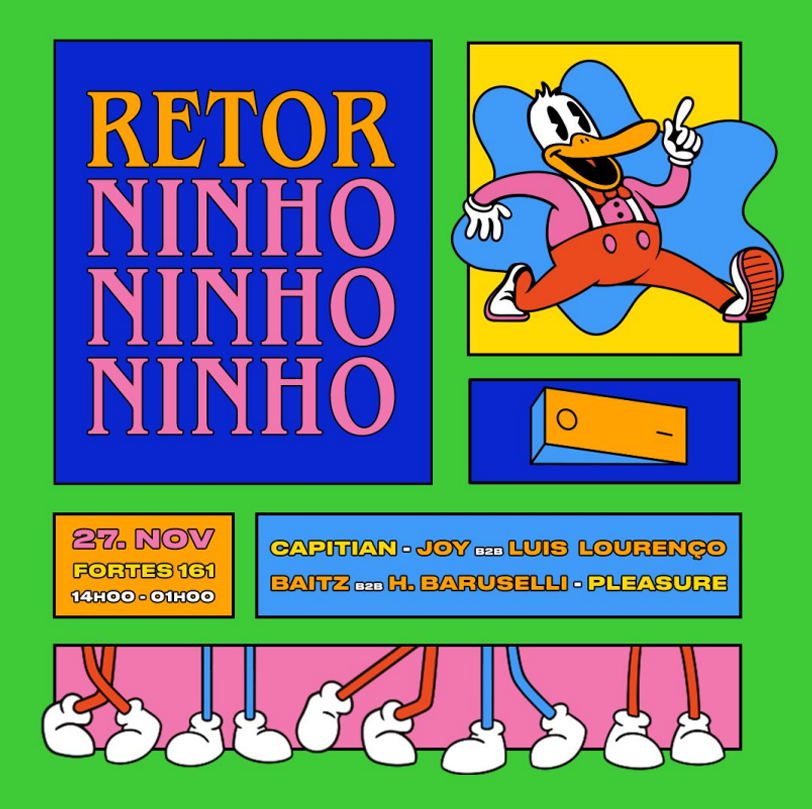
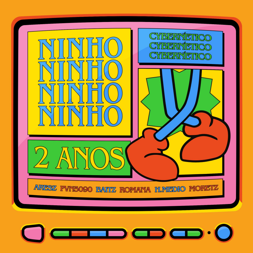
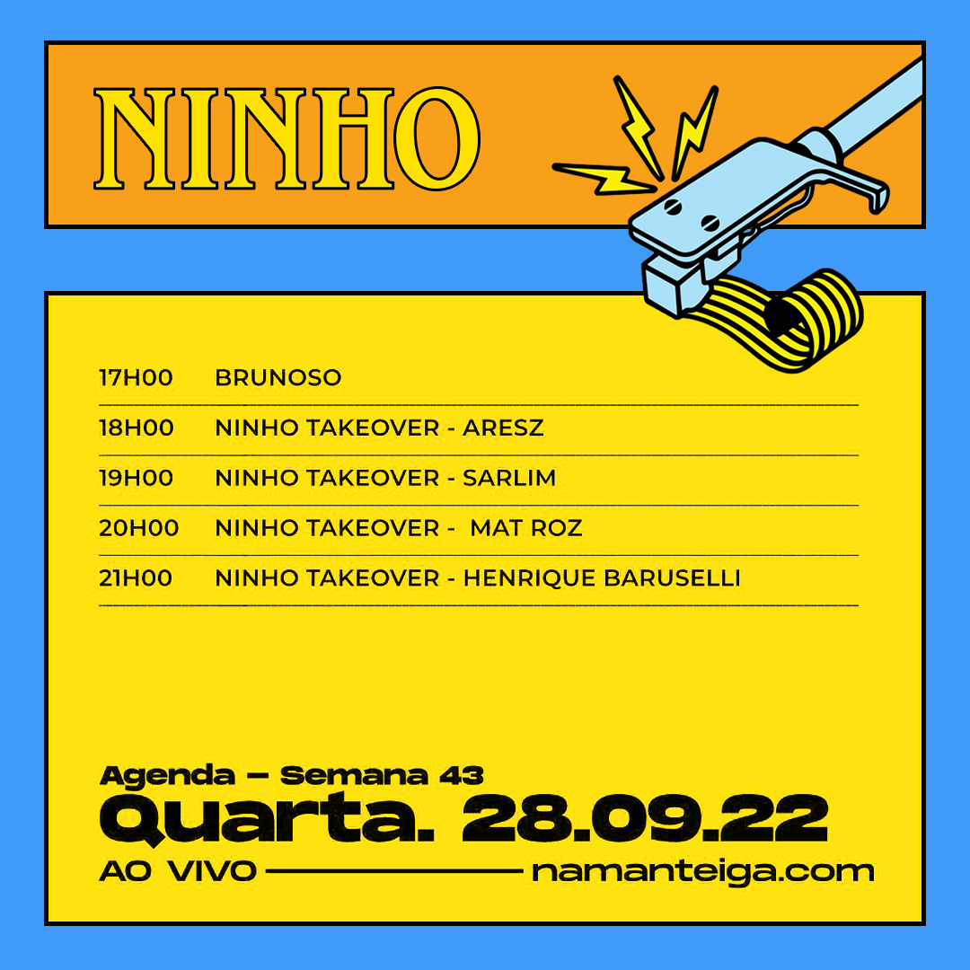
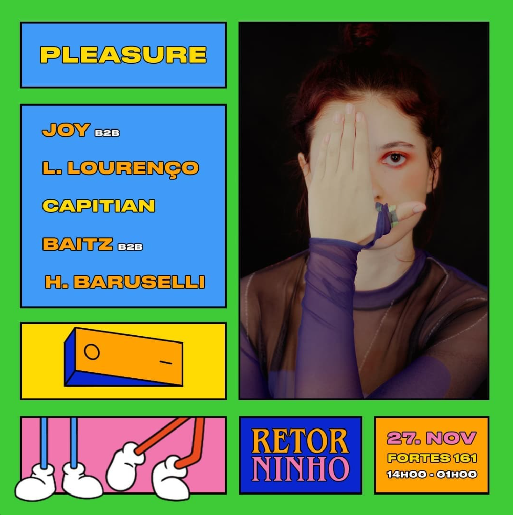
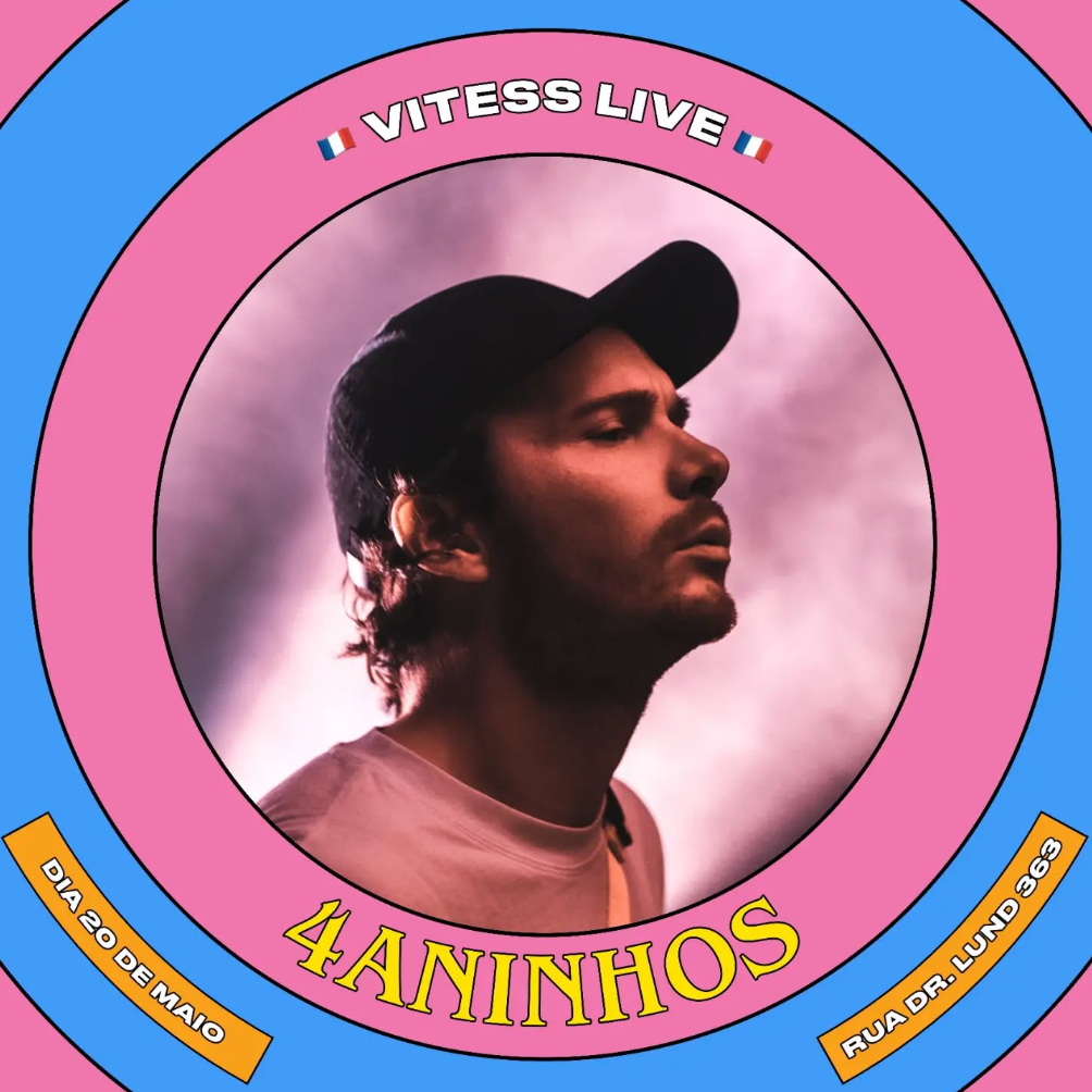
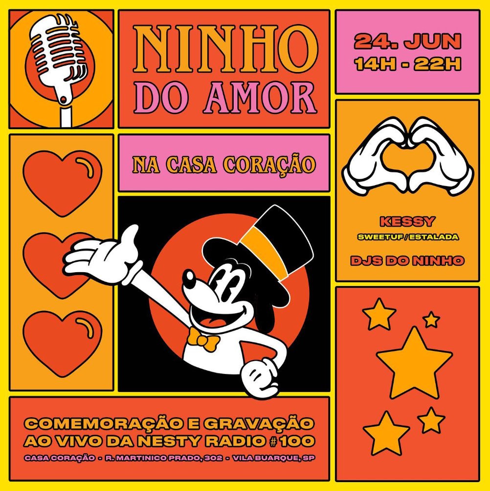
The event promotion assets are built on a dynamic grid system inspired by comic book panels. Each block of information; headlines, artist lineups, or illustrations, is contained within its own distinct, outlined box, creating a playful sense of order and allowing complex information to be presented with clarity.
To give the brand's radio shows their own distinct presence, a flexible sub-identity was created. While the system still uses the main brand's "comic panel' a focus on photography, it allows each individual radio show to have its own unique character and color scheme. This approach creates a cohesive design system and brand identity, while giving each show its own distinct and recognizable personality.