Translating Sound Into Visuals
The Challenge
The project's challenge was to act as a bridge for the label between each artist's unique musical concept and the established visual culture of the lo-fi house scene. The goal was to develop a process that could translate an artist's sound, emotions, and inspirations into visuals that were both deeply personal and culturally resonant, elevating the genre's visual aesthetic without losing its raw authenticity.
The Solution
The Solution
The solution was an art direction strategy rooted in the culture of the lo-fi house movement and built around a unifying concept: the contrast between past and future, analogue and digital. This creative thread was brought to life by intentionally blurring the lines between mediums, exploring how analogue techniques could be applied to digital sources and vice-versa. The resulting visual universe was applied across all deliverables, from video-clips for releases to Spotify visualizers and album campaigns, allowing unique narratives, developed in close collaboration with each artist, to unfold.
The Result
The collaboration resulted in a cohesive and recognizable visual identity across numerous successful releases. The motion pieces generated high community engagement, directly supporting the physical market with frequent sell outs of vinyl and cassette runs. This consolidated visual system solidified the label's aesthetic, accurately translating the artists' unique visions across all necessary media outputs required for modern promotion.
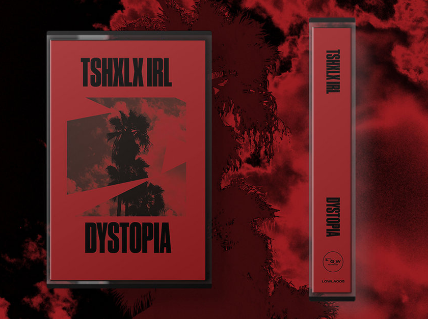
The design for each release was a direct collaboration, focused on bringing the artist's unique ideas to life. The creative challenge was to translate their individual concepts into visuals while ensuring every piece felt cohesive and true to the label's unified identity.
A notable example is the 25-minute visual album created in collaboration with South African producer Tshxlx irl. In this visual narrative, original Super 8 footage from the 60s was treated as a living stage, where the characters dances across these memories, moving in perfect sync with the music.
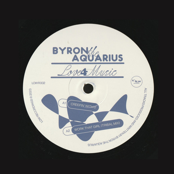
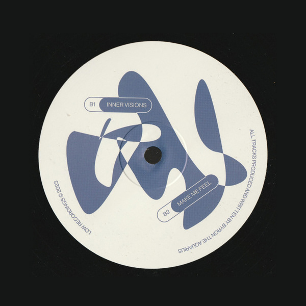
For the vinyl artwork and music videos of Byron The Aquarius's "Love for Music", the concept was to explore the contrast between physical and digital memory. For the video-clip, Vintage footage from the artist's hometown was treated to feel like tangible, printed paper cutouts and then analog-processed with the warm imperfections and colors of VHS tape. The result is a visual world that feels both tactile and deeply soulful, a direct reflection of the music's character and the artist's vision for the release.
For the LA artists ON & ON "Midnight" EP teasers, the core concept was again to explore the lines between digital and analogue. Vintage Los Angeles footage was digitally processed and filtered through a physical medium, giving each frame the authentic, tactile dimension of print. This new textured world was then brought back into the digital realm, where the distortions were applied to react to the beats.
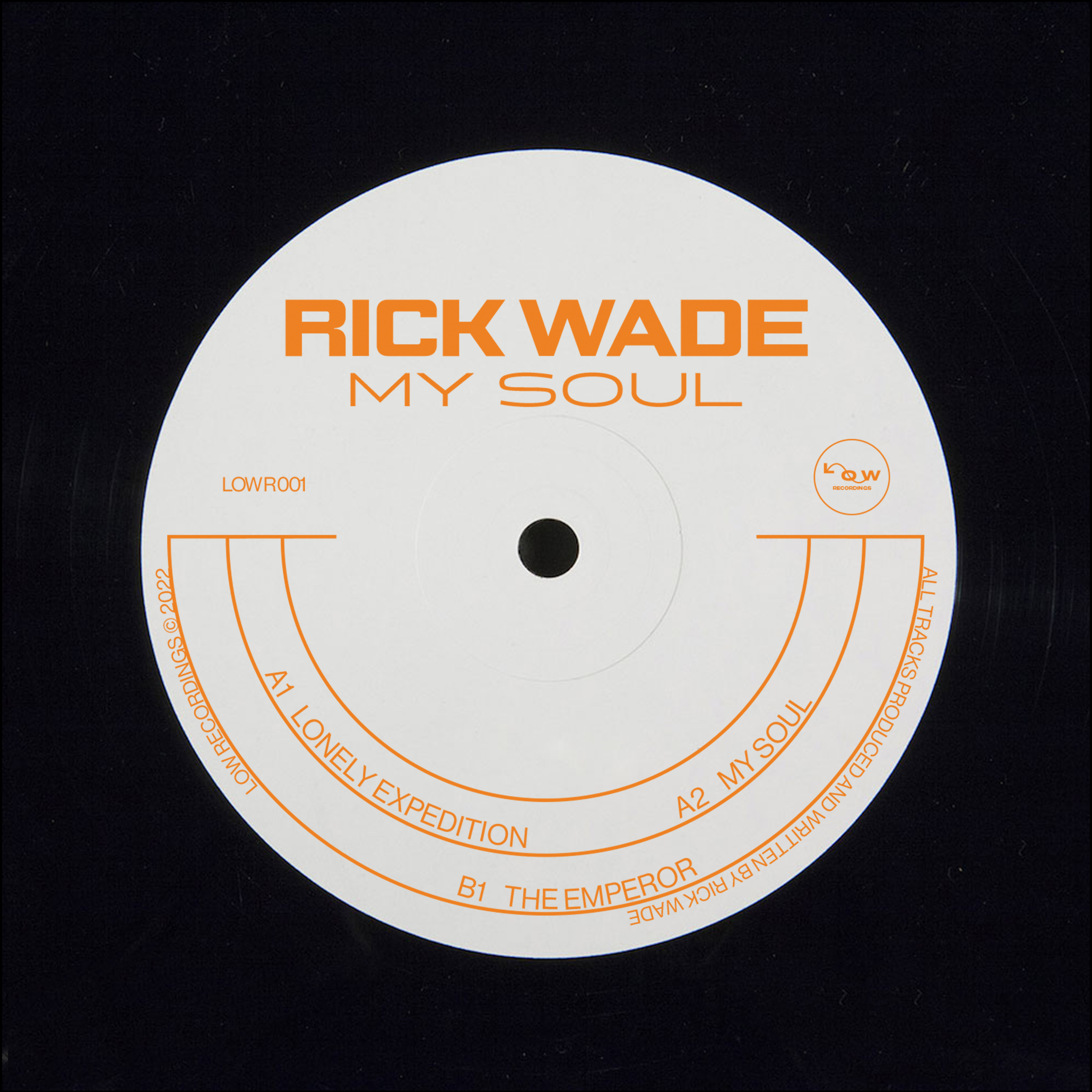
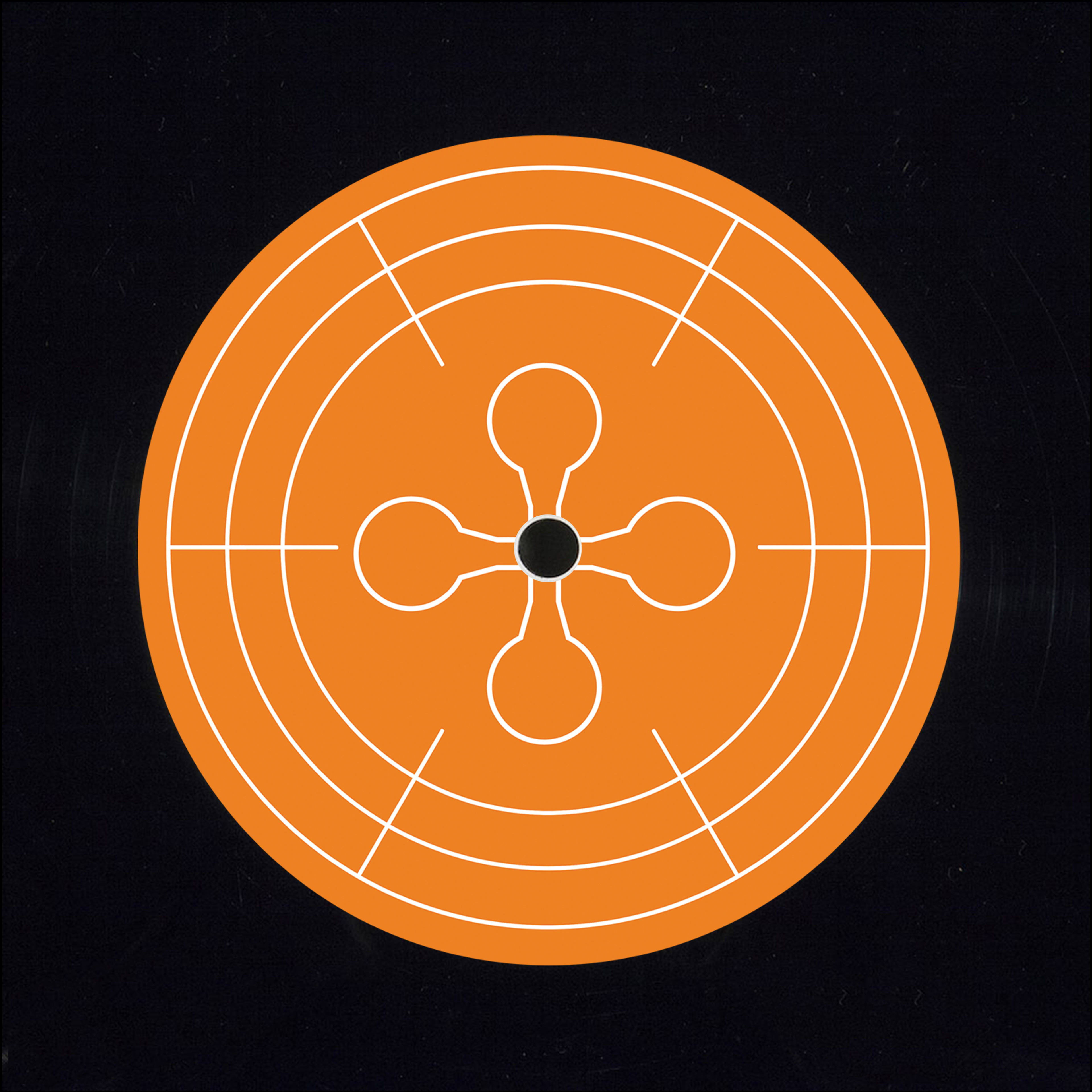
The art direction for this Rick Wade release was based on a contrast of texture and dimension. A custom 3D asset was designed to serve as the release's central icon. For the album artwork and Spotify visualizers, short, hypnotic video loops were created as visualizers. These pieces often focused on a single element, in this case the 3D asset, designed to capture the track's core feeling in a concise and endlessly watchable format.
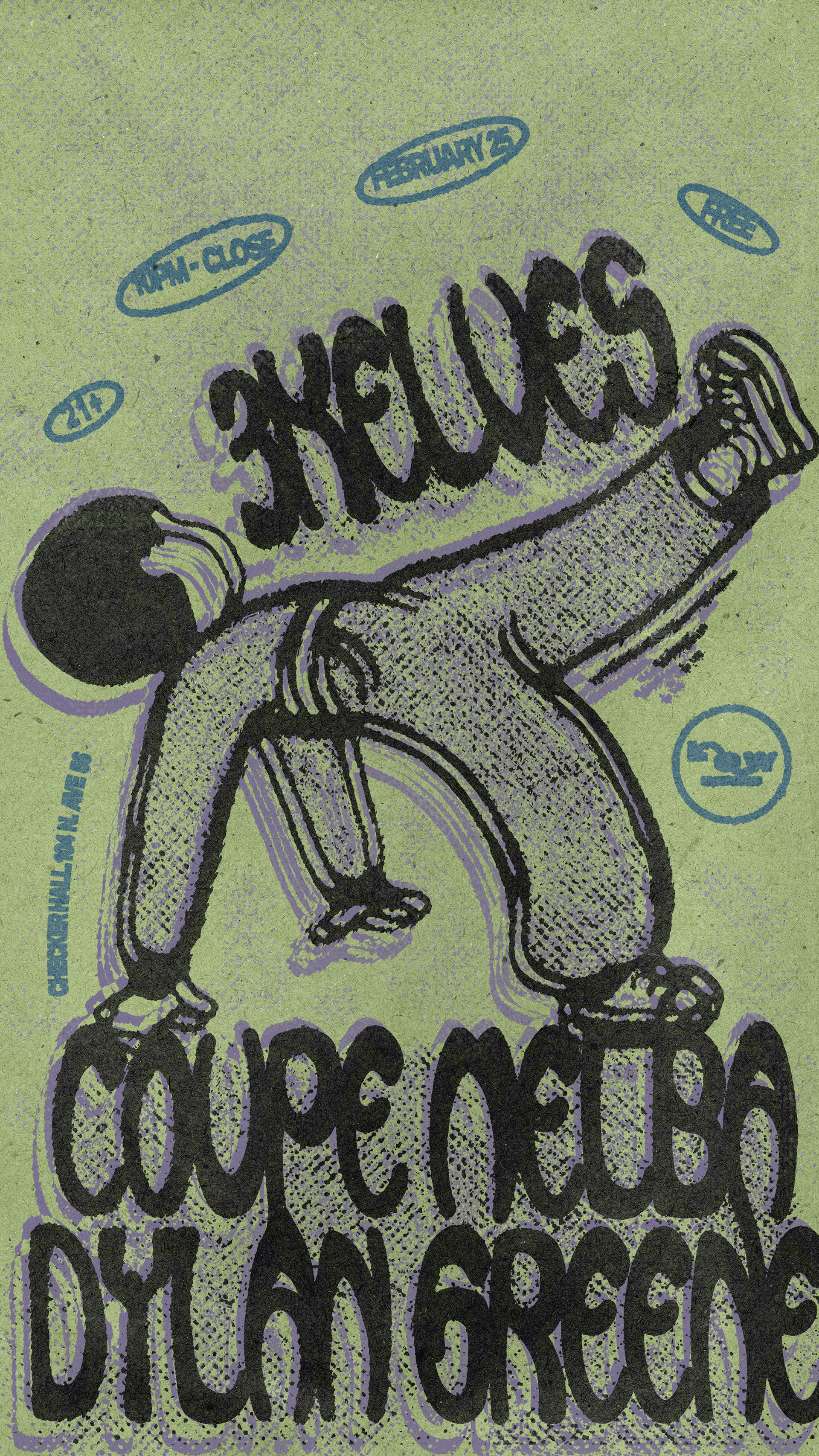
The The primary objective for the event flyers was to establish a tangible visual presence within a digital environment. Each design originated from scanned physical materials, incorporating heavy paper grain and raw ink textures. This analog foundation was subsequently processed with sharp digital colors and procedural glitches, generating an aesthetic that merges physical deterioration with digital techniques.